Struggling with the right color temperature for a project? Making the wrong choice can ruin the feel of a space. But lighting choices do not have to be so complex.
Color temperature, measured in Kelvin (K), sets the mood of light from warm to cool. For commercial projects, it influences productivity, atmosphere, and even safety. Getting it right is a critical first step for any successful lighting plan, ensuring the space functions as intended.
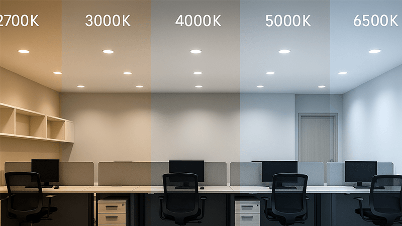
Choosing the right color temperature looks simple. You just pick a number on a spec sheet, like 3000K or 4000K, and you are finished. My years in the LED lighting industry taught me it is much more than that. I learned that this small detail can impact everything from your client's electricity bill to their employees' well-being. There are hidden factors that many people miss. Let's explore what you really need to consider for your next big project.
How does color temperature affect lighting?
Have you ever entered a room and felt instantly relaxed or suddenly alert? The color of the light was probably responsible. This single factor can make or break a space's success.
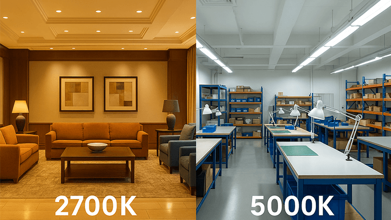
Color temperature deeply impacts how we feel in a space. Warm light, which is below 3000K, creates a cozy, relaxing feeling perfect for hotels or restaurants. Cool light, above 4000K, feels energizing and is better for focus, suiting offices and hospitals.
When I first started in this business, I thought color temperature, or CCT1, was all about aesthetics. But I quickly learned it has a technical and even biological side. There are critical details behind the Kelvin number that every purchasing manager should know.
The CCT and Efficacy Connection
One of the first "factory secrets" I learned was the relationship between CCT and luminous efficacy2 (lumens per watt). As a general rule, the higher the Kelvin temperature, the higher the efficacy. A 5000K LED panel will almost always be more energy-efficient than a 3000K panel from the same product family. The reason is simple physics. All white LEDs start with a blue LED chip. To create warmer light, manufacturers add more layers of phosphor to convert the blue light into yellow and red tones. This conversion process causes a small loss of energy as heat. Cooler CCTs require less phosphor, meaning less energy loss and more light output for the same amount of power. For large projects, this efficiency difference can lead to significant energy savings3.
Beyond Mood - The Biological Impact
The effect of CCT goes deeper than just feelings; it affects our bodies. Our internal clock, or circadian rhythm4, is heavily influenced by light. Cool, blue-toned light, like that from a 5000K source, tells our brain it is daytime. It suppresses the production of melatonin, the hormone that makes us sleepy, and boosts alertness. This is great for a workshop or a factory floor where concentration is key to safety and productivity. On the other hand, warm light has very little blue content. It allows our bodies to produce melatonin naturally, signaling that it is time to wind down. This is why you will never see a 5000K light in a high-end restaurant's dining area—it would make the guests feel restless instead of relaxed.
| CCT Range | Typical Efficacy (lm/W) | Common Application | Psychological Effect |
|---|---|---|---|
| 2700K - 3000K | Lower | Restaurants, Hotels | Relaxing, Cozy |
| 3500K - 4000K | Medium | Offices, Retail | Neutral, Focused |
| 5000K - 6500K | Higher | Warehouses, Hospitals | Alert, Clinical |
Is 3500K or 4000K better for an office?
Picking between 3500K and 4000K for an entire office feels like a small decision. But the wrong choice can lead to complaints of a sterile atmosphere or visual fatigue.
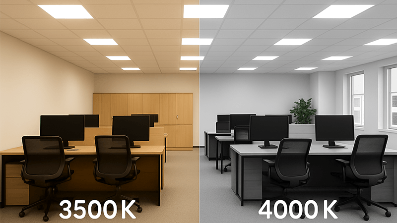
Both 3500K and 4000K are great choices for offices. 4000K provides a crisp, cool white light that boosts concentration. 3500K offers a neutral, slightly warmer white that feels more welcoming. The best option depends entirely on the company's culture and desired atmosphere.
I get this question almost every week from clients. There is no single correct answer, but understanding the subtle differences between them is key. The decision often comes down to the specific goals for the workspace, and sometimes, even where in the world the office is located.
The Case for 4000K: Focus and Clarity
4000K is often called "cool white" and sits right in the middle of the CCT spectrum. It renders colors accurately and provides a clean, modern feel that many companies now want. The light is bright and crisp without being harsh or blue. This level of light is excellent for tasks requiring high levels of concentration and visual acuity5, like accounting, engineering, or design. It closely mimics natural daylight, which helps keep employees alert and productive throughout the workday. Most of our corporate clients who prioritize a modern aesthetic and peak performance from their staff lean towards 4000K for their general office spaces.
The Case for 3500K: A Softer, Welcoming Approach
3500K is a "neutral white," but it has a noticeably warmer, softer tone than 4000K. It bridges the gap between the cozy feel of 3000K and the crispness of 4000K. This makes it a fantastic choice for companies that want to create a more collaborative, inviting atmosphere. It reduces the "clinical" feel that some people associate with 4000K lighting. 3500K works very well in spaces that mix individual workstations with relaxed breakout areas, employee lounges, and cafes. It provides enough clarity for work while maintaining a comfortable and stress-free environment that feels more like a community and less like a factory.
The Cultural Factor You Can't Ignore
Here is something I have learned from working with partners worldwide: CCT preference is cultural. I remember a large project in the UAE, a region I know our reader Shaz is very familiar with. The client insisted on 5000K for their offices. To a European client, this might seem incredibly harsh. But in a hot climate, the psychologically cooling effect of blue-white light is often preferred because it feels clean and refreshing. In contrast, my partners in Northern Europe often request 3000K even in offices. They want to create a warm, cozy "hygge" feeling to contrast with the cold, gray weather outside. So, the 3500K vs. 4000K debate is not universal. The right choice for an office in Dubai might be completely wrong for one in Stockholm.
When recommending commercial lighting6 for offices and workshops, which color temperature would you recommend?
You have a big project with different spaces, from offices to workshops. One blanket recommendation will not work. A bad choice in one area can compromise the entire project's success.
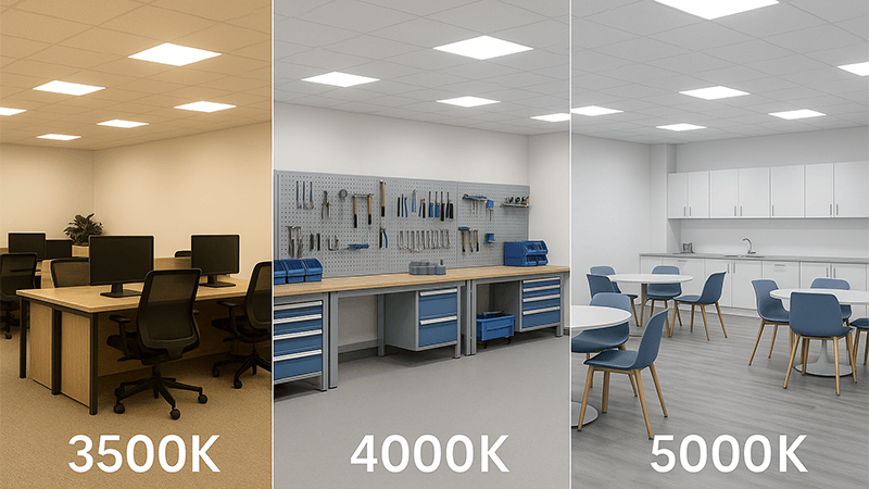
For offices, I recommend 3500K-4000K to support focus. For workshops where fine detail is critical, 5000K provides crisp, daylight-like clarity. You must always match the CCT to the specific tasks being performed in each distinct area of the building.
A successful lighting plan is never a one-size-fits-all solution. You need to develop a strategy that considers the unique function of each room. I also tell my clients to look beyond just the CCT number to ensure true quality and to think about the future of their workspace.
A Tailored CCT Strategy
Different tasks require different lighting. An open-plan office needs a different CCT than the attached warehouse. My approach is always to zone the lighting plan based on function. For example, in a corporate headquarters, I would recommend 4000K for the main work areas to keep people focused. But for the breakout rooms and kitchen, I would use a warmer 3500K to encourage relaxation and social interaction. The conference rooms might even get tunable lighting. In an industrial facility, the priorities are different. The workshop or assembly line needs 5000K for maximum visual acuity and safety. The adjoining offices can be 4000K, while the locker rooms could be a more comfortable 3500K. Thinking in zones is the key.
The Importance of Consistency: The MacAdam Ellipse
Here is a detail that separates experienced procurement managers from beginners. Specifying "4000K" is not enough to guarantee quality. I once saw a project where all 500 downlights were specified as 4000K, but when installed, some looked slightly pinkish and others slightly greenish. The client was furious. This happened because the manufacturer had poor color consistency control. The solution is to look for a tight MacAdam Ellipse7 or SDCM (Standard Deviation of Color Matching) rating. An SDCM of less than 3 (a 3-step ellipse) is invisible to the human eye. It ensures that every single light fixture in your order will look identical. For any large-scale project, I insist on products with a <3 SDCM rating. It is a promise of quality.
The Future is Dynamic and Tunable
The most forward-thinking solution is to move away from static CCT altogether. The future of commercial lighting is tunable white technology8. These systems allow you to adjust the CCT of the lights throughout the day. You can program the lighting to mimic the natural progression of sunlight—cool and energizing in the morning (5000K), neutral in the afternoon (4000K), and warm in the evening (3000K). This is known as human-centric lighting, and it supports our natural circadian rhythms, improving well-being and productivity. It also offers ultimate flexibility. A conference room can be set to 4000K for a high-stakes presentation and then adjusted to a warm 3000K for a collaborative brainstorming session. It is the ultimate way to future-proof a commercial space.
| Commercial Space | Recommended CCT | Rationale |
|---|---|---|
| Open Office | 3500K - 4000K | Promotes focus and alertness without being sterile. |
| Conference Room | 4000K (or Tunable) | Cool for presentations, warmer for collaboration. |
| Break Room | 3000K - 3500K | Creates a relaxing, comfortable atmosphere for breaks. |
| Workshop/Lab | 5000K | Enhances visibility for detailed, precise tasks. |
| Warehouse | 5000K - 6000K | Maximizes brightness and safety over large areas. |
What color temperature should commercial kitchen lights be?
Poor lighting in a commercial kitchen is a recipe for disaster. It can make fresh food look unappetizing or, worse, hide spills and hazards, leading to serious hygiene and safety issues.
Commercial kitchen lighting should be between 4000K and 5000K. This cool, bright light improves visibility for safe food preparation, makes spaces look cleaner, and ensures staff can accurately judge the freshness of ingredients.
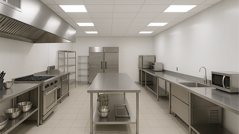
When it comes to commercial kitchens, lighting is not about ambiance; it is about safety, cleanliness, and quality control. The stakes are incredibly high, and the lighting choices must reflect that. The CCT is just the starting point for creating a safe and efficient kitchen environment.
Safety and Cleanliness First
A commercial kitchen is a fast-paced, potentially dangerous environment full of sharp knives, hot surfaces, and wet floors. Maximum visibility is non-negotiable. A cool CCT between 4000K and 5000K provides a bright, high-contrast light that reduces shadows and makes it easy to see what you are doing. This CCT range also works exceptionally well with stainless steel surfaces, which are common in kitchens. It makes these surfaces look bright and clean, and more importantly, it makes it incredibly easy to spot grease, dirt, and spills. This is essential for meeting health and safety standards. A warmer CCT would create a yellowish tint that could easily hide contamination.
The Critical Role of Color Rendering Index (CRI)
In a kitchen, seeing colors accurately is just as important as seeing clearly. This is where the Color Rendering Index (CRI)9 comes in. CRI is a scale from 0 to 100 that measures how well a light source reveals the true colors of objects. For a kitchen, a high CRI is absolutely essential. A chef needs to see the subtle red of perfectly cooked meat, the vibrant green of fresh herbs, or the faint discoloration on a piece of fish that is past its prime. Under a low CRI light, red meat can look brown and dull, and vegetables can appear lifeless. This can lead to poor quality food being served or even food safety issues. For any kitchen space, I never recommend anything less than a CRI of 90. The combination of 4000K-5000K CCT and 90+ CRI is the professional standard.
Lighting Zones Within the Kitchen
Just like an office, a kitchen has different zones with different needs. A smart lighting plan reflects this.
- Food Preparation & Inspection Areas: These stations need the best light possible. I recommend 5000K with a 90+ CRI to ensure chefs can see ingredients perfectly.
- Cooking Line: The lighting here needs to be bright and high-CRI, but the fixtures also need to be durable and able to withstand high heat and grease.
- Storage & Pantry: Lighting in walk-in refrigerators and dry storage areas can be a standard 4000K. The key here is even illumination so labels are easy to read.
- Dishwashing Area: Bright, cool light (4000K-5000K) is critical here to help staff verify that every pot, pan, and plate is perfectly clean.
Conclusion
Color temperature10 is not just a number on a specification sheet. It impacts feel, efficiency, and safety. A smart, tailored approach always wins over a simple, one-size-fits-all choice.
Understanding CCT is essential for selecting the right lighting for different environments. ↩
Discover how luminous efficacy affects energy efficiency and lighting performance. ↩
Discover the financial benefits of selecting the right lighting for your projects. ↩
Explore the connection between light and our biological clock for better well-being. ↩
Learn how lighting impacts visual acuity and productivity in workspaces. ↩
Discover effective strategies for designing lighting in commercial spaces. ↩
Find out how the MacAdam Ellipse ensures color consistency in lighting fixtures. ↩
Discover how tunable white technology can enhance the flexibility of lighting solutions. ↩
Understand the importance of CRI for accurate color representation in various settings. ↩
Understanding color temperature is crucial for creating the right ambiance in any space. ↩

