Struggling to pick the right light color for your projects? The wrong choice can completely ruin a room's intended feel. I will show you how to select the perfect color temperature every time.
The best color temperature for COB LED downlights depends on the application. For homes, 3000K creates a warm, inviting feel. For offices and retail, 4000K provides a clean, alert atmosphere. Always match the Correlated Color Temperature (CCT) to the function of the space.
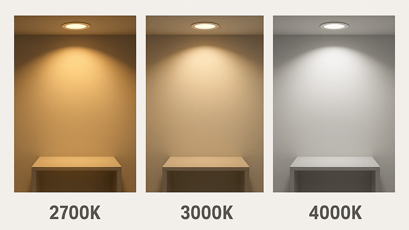
You already know that color temperature is key. As a purchasing manager, you make these decisions daily. But the details matter even more when you are sourcing for large projects. Things like the subtle differences between Kelvin values can make or break a design. The consistency of that color across a thousand units is what separates a good supplier from a great one. Let's look closer at the most common choices you face every day and what to watch out for.
What is the difference between 3000K and 4000K COB?
Choosing between 3000K1 and 4000K2 can be difficult. The final look and feel of the space depend heavily on this choice. Let me break down the key differences for you.
3000K COB LEDs produce a warm white3 light, similar to a halogen bulb, which is ideal for creating a cozy atmosphere. In contrast, 4000K produces a neutral or cool white light that feels more energizing, modern, and is better for task-oriented environments4.
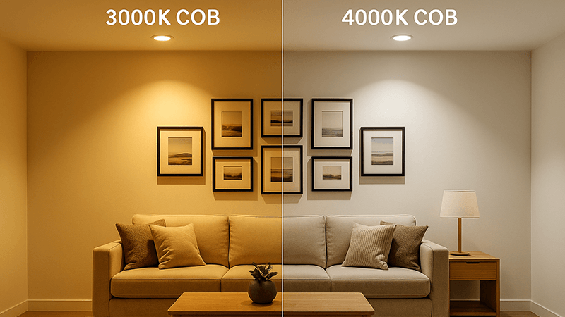
The choice between 3000K and 4000K goes beyond a simple preference for "warm" or "cool." It directly impacts how people feel and perform in a space. It also changes how colors of furniture, walls, and merchandise appear. As a buyer, you need to understand the exact application to make the right call.
Application and Atmosphere
A 3000K light source is often described as "soft white" or "warm white." It has a yellowish tint that we associate with traditional incandescent and halogen bulbs. This color temperature5 is perfect for creating a relaxed, comfortable, and intimate environment. I recommend it for places where people unwind. Think of residential living rooms, bedrooms, and fine dining restaurants6. For a hospitality project in Dubai, a client of mine insisted on 3000K for all guest rooms and lounges to create a luxurious, welcoming escape for travelers.
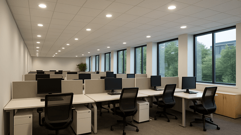
On the other hand, 4000K is called "neutral white" or "cool white." It sits between warm yellow and stark blue light, providing a clean, balanced look. This light is great for environments where focus and clarity are important. I always suggest 4000K for modern offices, commercial kitchens7, retail showrooms, and healthcare facilities. The light is less relaxing and more energizing, which can improve productivity and make details easier to see.
Visual Impact on Spaces
This table breaks down where each color temperature works best:
| Feature | 3000K (Warm White) | 4000K (Neutral White) |
|---|---|---|
| Best For | Hospitality, high-end residential, restaurants | Offices, retail, supermarkets, healthcare |
| Atmosphere | Cozy, relaxing, intimate, traditional | Alert, clean, modern, productive |
| Color Perception | Enhances reds, oranges, and wood tones | Renders colors more accurately, balanced |
| Common Use | Living rooms, bedrooms, hotel lobbies | Kitchens, bathrooms, garages, commercial spaces8 |
For a purchasing manager like yourself, Shaz, the key is to get a clear brief from your project team. If they say "we want the hotel to feel like a home away from home," 3000K is your answer. If they say "we need our office staff to be focused and energized," you should source 4000K. Misunderstanding this can lead to a space that feels completely wrong for its purpose.
What is the temperature of a cob LED?
Are you concerned about the operating heat of COB LEDs? This is a different "temperature" from the color, but it is just as critical for product longevity and safety. Let's clarify both concepts.
A COB LED has two temperatures. First is the Correlated Color Temperature (CCT)9, like 3000K or 4000K, which describes the color of the light. Second is the operating or junction temperature (Tj), which can reach 85°C to 125°C and must be managed by a heat sink.
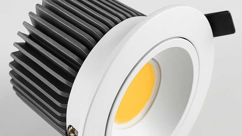
When I started in this business, the jargon was confusing. We talk about temperature for color (Kelvin) and temperature for heat (Celsius). Both are vital for quality lighting. As a factory owner, I spend a lot of time on heat management10 because it's the number one factor in an LED's lifespan. A COB packs many small LED chips into a very tight space. This design is great for creating a powerful, uniform beam of light, but it also generates a lot of concentrated heat. Without proper cooling, that heat will quickly degrade the LED chips, causing the light to dim and fail prematurely.
Color Temperature (CCT) Explained
This is the "temperature" most people refer to when choosing lights. It's measured in Kelvin (K) and describes the visual appearance of the light.
- Warm Light (2700K - 3000K): Creates a yellow-hued, cozy light.
- Neutral Light (3500K - 4000K): A balanced white light, good for focus.
- Cool Light (5000K - 6500K): A blue-hued light, similar to daylight, used for industrial and high-task areas.
Operating Temperature (Heat) Explained
This refers to the physical heat generated by the COB chip during operation. It's managed by the luminaire's design, specifically the heat sink.
- Junction Temperature (Tj): This is the temperature at the very heart of the LED chip. For most COBs, manufacturers recommend keeping the Tj below a certain threshold, often around 105°C, to ensure a long life of 50,000 hours or more.
- Heat Sink: This is a critical component, usually made of aluminum, that draws heat away from the COB chip and dissipates it into the air. A poorly designed heat sink is a common failure point in cheap downlights. When you source products, always ask the manufacturer about their heat sink design and the materials used. A heavier, well-designed aluminum housing often indicates better thermal management. For your projects in the UAE, where ambient temperatures can be high, superior thermal management is not a luxury; it is a necessity for product survival.
Is 4000K cool, white or daylight?
The terms for color temperature can be confusing. Is 4000K considered cool white, or is it neutral? And how does it compare to daylight? This is a common point of confusion.
4000K is best described as neutral white or cool white. It sits right in the middle of the spectrum, lacking the strong yellow tones of warm white and the harsh blue tones of daylight. It provides a clean, balanced light that is brighter and whiter than 3000K.
Thinking about the spectrum of light helps make this clear. Imagine a scale. On one end, you have the warm, orange-yellow glow of a candle (around 1900K). On the other end, you have the bright, blue-sky of a clear day (6500K or higher). 4000K falls almost exactly in the middle. It’s why some people call it "neutral white11" and others call it "cool white." Both are correct depending on what you are comparing it to. Compared to 3000K, it is cooler. Compared to 6500K, it is warmer.
Comparing 4000K to Other CCTs
I always advise clients to look at samples in the actual space, but here is a guide for when that's not possible. Understanding these distinctions is crucial when specifying lighting for different environments.
- Warm White (2700K-3000K): This range has a noticeable yellow or golden hue. It is very relaxing and is the standard for residential spaces where you want to feel comfortable. 4000K looks significantly crisper and less "cozy" next to it.
- Neutral White (4000K): This is your baseline white light. It renders colors accurately without tinting them yellow or blue. This neutrality is why it’s so popular in retail and office settings. You see products and workspaces clearly, and the environment feels modern and clean.
- Daylight (5000K-6500K): This range has a distinct blueish tint. It mimics the bright light of midday. While excellent for task-heavy environments like warehouses, workshops, or hospitals where maximum visibility is required, it can feel sterile or harsh in an office or home. 4000K provides a softer, more balanced alternative that is still bright and functional. It gives you clarity without the clinical feel of a 6500K light.
Here's a simple comparison table:
| CCT | Common Name | Appearance | Effect |
|---|---|---|---|
| 3000K | Warm White | Yellowish-white | Relaxing, cozy |
| 4000K | Neutral / Cool White | Pure, balanced white | Alert, clean, modern |
| 6000K | Daylight | Blueish-white | Intense, clinical, high-visibility |
For your work, recommending 4000K is a safe and effective choice for most commercial applications. It offers the clarity of cool light without the harshness of true "daylight" CCTs.
What color should downlights be?
You need to deliver the right lighting for a client's project. How do you decide on the single best color for their downlights? It all comes down to the room's function.
The ideal color for downlights depends entirely on the purpose of the space. Use warm white (2700K-3000K) for relaxation areas like bedrooms and living rooms12. Use neutral white (3500K-4000K) for task areas like kitchens, offices, and retail stores.
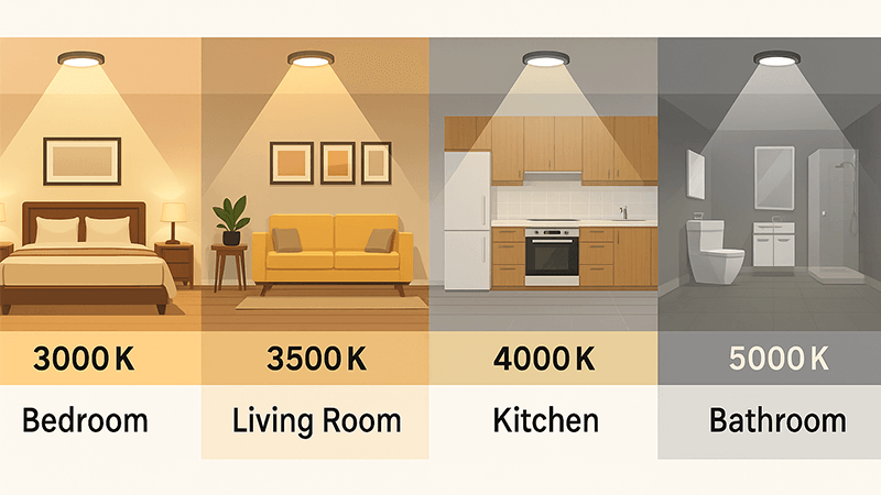
There is no single "best" color. The biggest mistake I see is when a single color temperature is used throughout an entire building, from the lobby to the office to the breakroom. Each space has a different purpose, and the lighting should support that purpose. A warm, cozy light is great for relaxing, but it can make you feel sleepy in an office. A cool, crisp light is great for focus, but it can feel sterile and unwelcoming in a living room. Guiding your clients through this choice shows your expertise.
A Room-by-Room Guide
As a manufacturer, I've helped contractors and designers specify lighting for thousands of projects. Here’s the advice I give them, which has consistently led to successful outcomes. Breaking it down by room makes the decision simple for your clients.
-
Living Rooms & Bedrooms: These are places for relaxation. The goal is to create a comfortable, inviting atmosphere.
- Recommendation: 2700K - 3000K (Warm White). This CCT mimics the warm glow of traditional lamps and promotes restfulness.
-
Kitchens & Bathrooms: These are functional spaces where tasks are performed. You need clear, bright light to see properly, whether you're chopping vegetables or applying makeup.
- Recommendation: 3000K - 4000K (Warm to Neutral White). 3000K can work if you prefer a warmer feel, but 4000K is often better for task visibility, especially in modern designs.
-
Home Offices & Garages: These are task-oriented environments where focus and visibility are key.
- Recommendation: 4000K - 5000K (Neutral to Cool White). This clearer, brighter light helps reduce eye strain and can increase productivity.
The Critical Role of Consistency
One insight I must share, especially for a large-scale buyer like you, is the importance of color consistency13 across batches. A 3000K downlight from one batch must look identical to a 3000K downlight from another. As a rule, the color difference should be controlled within a tolerance of ±50K. Any deviation larger than this, for example, one light at 2950K and another at 3050K, will be visible to the naked eye. This can ruin a high-end installation. At my factory, we control this using tight binning of LED chips and rigorous quality control. Always ask your supplier about their MacAdam ellipse14 or SDCM (Standard Deviation of Color Matching) rating. A rating of <3 SDCM is excellent for professional projects. This ensures uniformity across your entire order.
Conclusion
Choosing the right color temperature is simple: match the light to the room's purpose. Warm light for relaxing, and neutral light for working. Your projects will look and feel better.
Learn how 3000K creates a warm, inviting atmosphere ideal for residential spaces. ↩
Discover why 4000K is preferred for modern offices and retail environments. ↩
Find out how warm white light enhances comfort in living spaces. ↩
Find out how to choose lighting that enhances productivity in workspaces. ↩
Understanding color temperature is essential for selecting the right lighting for different spaces. ↩
Understand how lighting can enhance the dining experience in upscale restaurants. ↩
Learn about the best lighting choices for functionality and visibility in kitchens. ↩
Explore effective lighting solutions for various commercial environments. ↩
Gain insights into how CCT affects the ambiance and functionality of spaces. ↩
Discover the significance of heat management in prolonging LED lifespan. ↩
Understand the role of neutral white light in task-oriented environments. ↩
Discover the ideal lighting options to create a cozy atmosphere in living rooms. ↩
Learn how maintaining color consistency can impact the quality of lighting installations. ↩
Explore how the MacAdam ellipse relates to color consistency in LED lighting. ↩

